When does transparency become overload in Web3?
Transparency is one of Web3’s proudest principles. Blockchains are open ledgers: every transaction, every contract, every movement of value is visible.
In theory, this builds trust. Unlike Web2, where companies hide flows of data and money, Web3 gives you everything upfront.
But transparency has a cost. For most users, it feels less like empowerment and more like drowning in noise. Instead of clarity, they face walls of addresses, hashes, gas fees, and contract interactions.
The paradox — The more “open” the system, the harder it becomes to see what matters.
Where transparency tips into overload
- Raw data instead of insight
Block explorers list every transaction, but few users can parse them. Seeing a 64-character hash doesn’t create trust; it creates confusion. - Overexposed risks
Wallets surface every permission request. Signing a smart contract often means scrolling through 10 pages of unreadable JSON. Users click “approve” blindly, overwhelmed by detail. - Cognitive fatigue
Transparency without hierarchy forces people to scan, compare, and interpret constantly. Instead of peace of mind, they get decision fatigue. - The illusion of safety
Many assume more information means more protection. In reality, flooding users with data often hides the signals that actually matter — like malicious approvals or unusually high gas costs.
UX opportunities
- Progressive disclosure
Not every user needs the same depth. Wallets and explorers could reveal essential facts upfront (“You’re granting spend approval to X token”) with the option to expand into raw detail if desired. - Signals over noise
Highlight anomalies, not everything. Instead of showing all contract calls equally, surface what’s unusual or risky. Context matters more than raw logs. - Human language
Replace contract jargon with plain words. “This app can move your USDC anytime until revoked” is far more useful than “approve(spender, amount=uint256.max).” - Trust indicators
Borrow patterns from safety design: warnings, credibility scores, and clear labels help filter complexity without hiding facts. Transparency should guide, not overwhelm. - Personal filters
Let users set preferences: a developer might want full logs, while a newcomer just wants to know if they’re about to lose funds.
Why it matters
Transparency only works if people can process it. Otherwise, it’s indistinguishable from opacity, a flood of unreadable data might as well be a black box.
The promise of Web3 isn’t just radical openness, but meaningful openness. Designing for this means asking: how do we surface what matters, without burying it in noise?
If users can’t tell whether they’re safe, empowered, or at risk, transparency has failed its purpose. The next wave of UX in Web3 won’t be about exposing more. It’ll be about exposing better.
When does transparency become overload in Web3? was originally published in Coinmonks on Medium, where people are continuing the conversation by highlighting and responding to this story.

추천 콘텐츠

Robotics Automation Prototyping: Engineering Kinetic Agility into End-Effectors
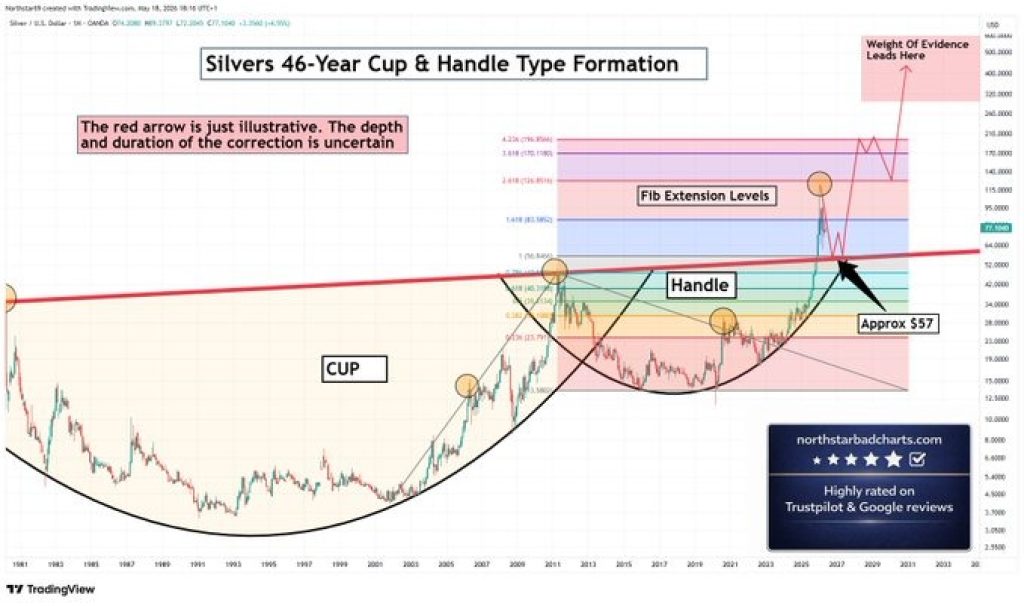
Silver Price Prediction: Cup and Handle Points to $196 – Why the Correction Was Always Part of the Plan