Why You Shouldn’t Judge by PnL Alone
\
I work in quantitative trading and build fully automated research environments and trading systems that help me go from market data to production trading strategies to performance analytics. One of the key requirements of such systems is to enable me to rapidly test my ideas and iterate fast to improve the overall trading performance. But how do I judge if I’m improving? PnL is a very obvious metric to tell if I’m doing better than before or not.
If you’ve ever run a live trading strategy, you’ll know this daily ritual: open dashboards to check fills, latencies, inventory and—inevitably—peek at PnL. That chart is seductive as it’s the ultimate scoreboard summarizing how successfully the business is doing. But judging changes by short-horizon PnL is one of the fastest ways to fool yourself. Markets are non-stationary, fills cluster, volatility regimes flip, microstructure shifts, and the distribution of outcomes is fat-tailed. If you “optimize” by reacting to PnL paths, you’ll end up chasing noise.
This post gives a practical view on how to replace PnL-chasing with statistical hypothesis testing—so your iteration loop gets more signal per unit of time.
Why PnL is a noisy metric
PnL is an aggregate of many random components:
- Market regime & volatility. Your daily PnL dispersion can double on a news-y day even if your system is unchanged.
- Fill randomness. Microsecond timing, queue position, fee tiers, hidden vs lit interaction—all inject randomness into trade outcomes.
- Path dependence. A few early wins compound into bigger notional exposure later (or vice versa), making the curve look convincing without changing the underlying mean outcome per trade.
- Multiple confounders. Changes to inventory caps, quote widths, internal crossing, or routing can move PnL in opposite directions and cancel or amplify each other.
PnL is a great target to track the business, but not necessarily a suitable metric to accept/reject research changes on short windows.
What we do want to know
When we ship a change (say, a new feature in the signal, a different quoting logic, a different execution rule), we want to answer:
This brings us to the world of statistical hypothesis testing, where we question the statistical significance of the observed outcomes. “By chance” means: Under a world where the change does nothing to the true mean outcome, how often would we see a difference at least as large as what we observed? That probability is the p-value. Small p-values mean “this would be rare if there was no real effect.” Large p-values mean “what you saw is common under noise.”
A hands-on example: two strategies that look different but aren’t
Let’s pretend we shipped a change and got some trades on a strategy before and after the change (either from backtest or from live trading). We now have two sets of per-trade PnLs:
- Strategy A: before the change
- Strategy B: after the change
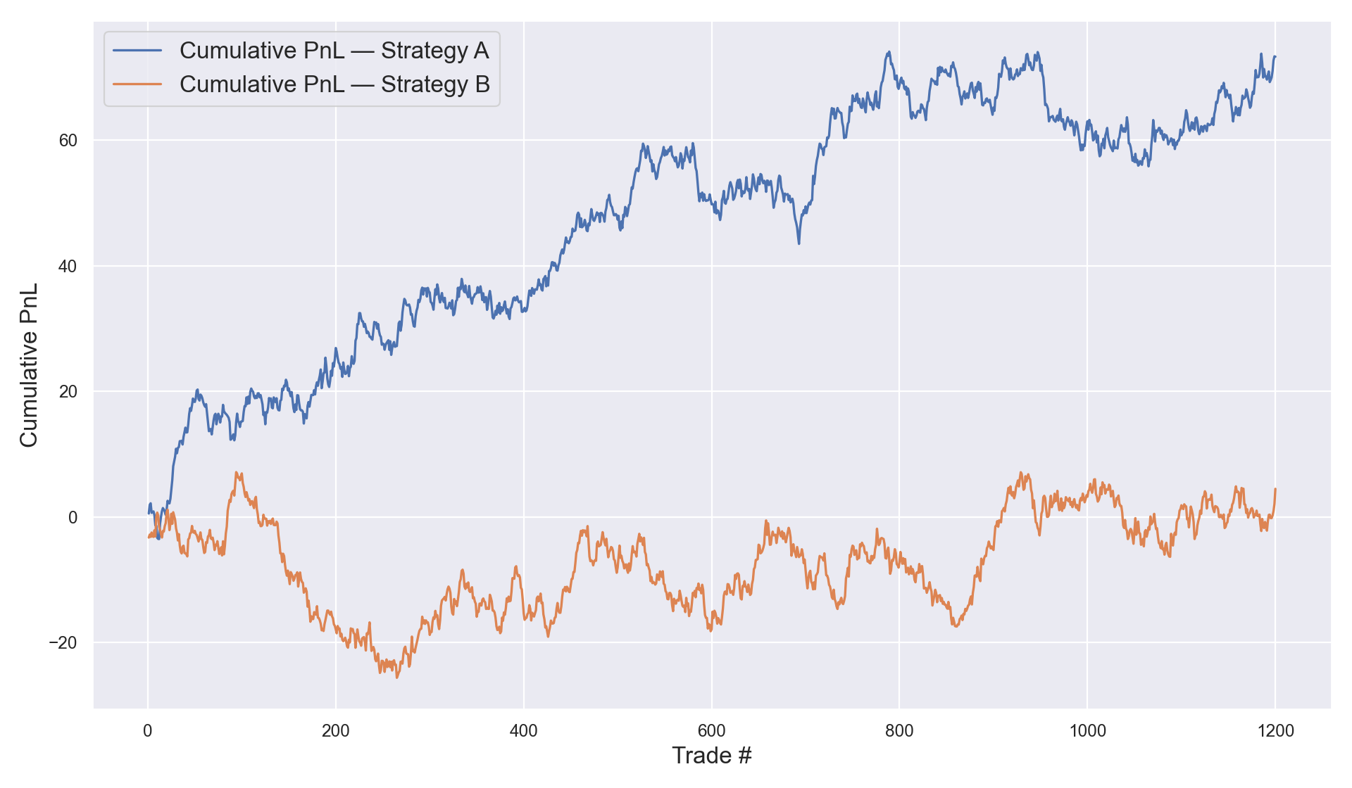
Below I generated two synthetic per-trade PnL series. The cumulative PnL lines diverge visibly—exactly the kind of picture that tempts teams to declare victory. But can we actually trust what we’re seeing and make conclusions based on it? After all, isn’t PnL the ultimate goal of a trading strategy? We’ll test whether the average per-trade PnL truly differs by running a common statistical test below.
The code I used to produce the plots and run a statistical test is below:
import numpy as np import pandas as pd import matplotlib.pyplot as plt from scipy import stats import seaborn as sns sns.set(); rng = np.random.default_rng(49) # generate PnLs per trade n = 1200 pnl_A = rng.normal(loc=0.0, scale=1.0, size=n) pnl_B = rng.normal(loc=0.0, scale=1.0, size=n) # generate cumulative PnLs cum_A = pnl_A.cumsum() cum_B = pnl_B.cumsum() # run a statistical test t_stat, p_value = stats.ttest_ind(pnl_A, pnl_B, equal_var=False) print(f"mean_A={pnl_A.mean():.4f}, mean_B={pnl_B.mean():.4f}") print(f"Welch t-statistic={t_stat:.3f}, p-value={p_value:.3f}") plt.figure(figsize=(12,7)) plt.plot(np.arange(1, n+1), cum_A, label="Strategy A") plt.plot(np.arange(1, n+1), cum_B, label="Strategy B") plt.ylabel("Cumulative PnL", fontsize=15); plt.xlabel("Trade #", fontsize=15); plt.legend(["Cumulative PnL — Strategy A", "Cumulative PnL — Strategy B"], fontsize=15) plt.tight_layout(); plt.savefig("cumulative_pnl_A_vs_B.png", dpi=160); plt.show(); Here are the numbers that it outputs:
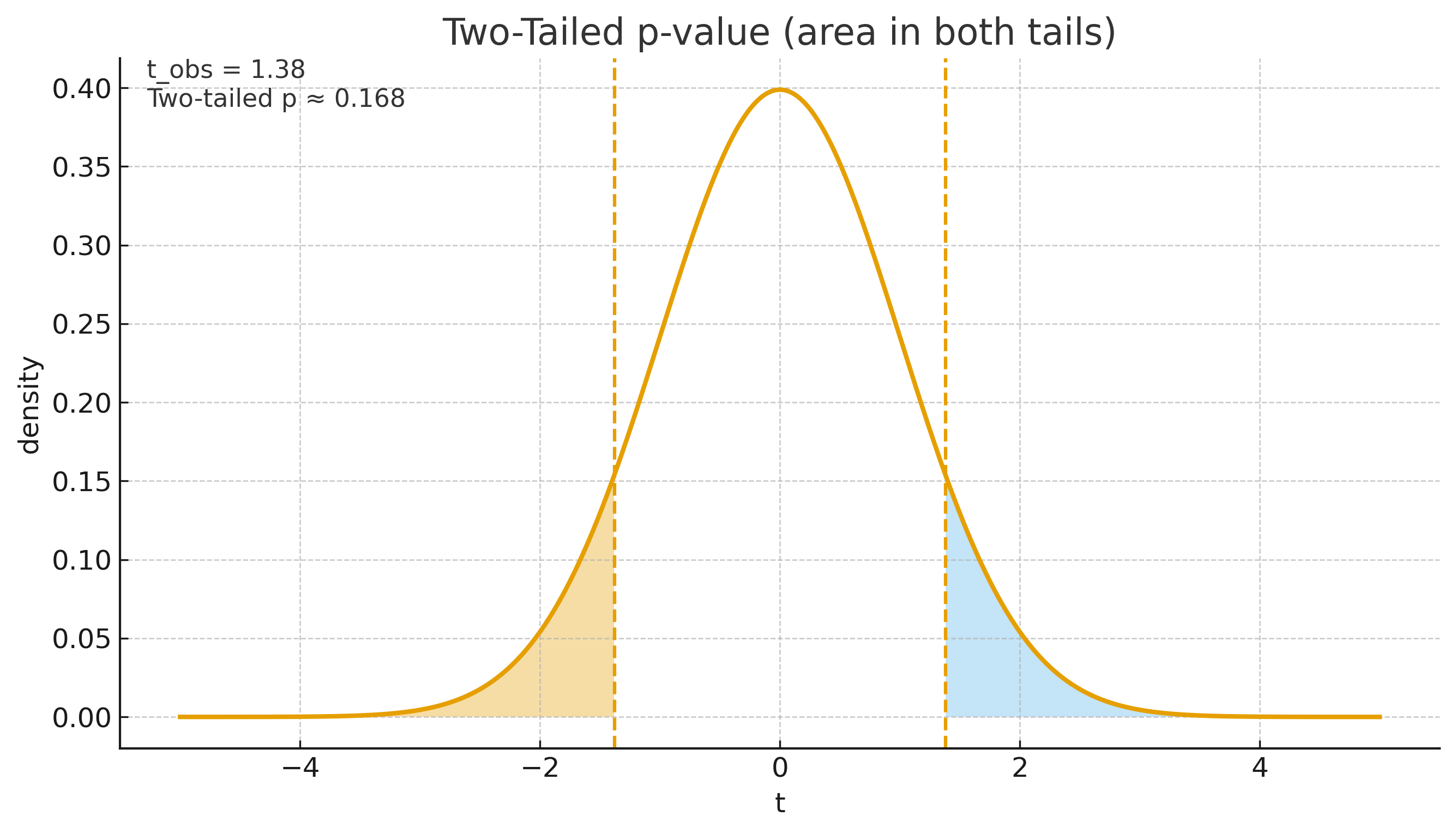
mean_A=0.0611, mean_B=0.0037 Welch t-statistic=1.380, p-value=0.168 We see the two standard outputs of a statistical test—a t-statistic and a p-value. I’ll tell more about them further down the story. For now, let’s state the interpretation: there is not enough evidence to say the mean per-trade PnL differs. Yet the two cumulative lines look pretty far apart. That’s the trap.
What just happened? (Demystifying hypothesis testing)
Most textbooks throw a formula and a table at you. Personally, I didn’t like this approach much the first time I was learning about statistical hypothesis testing, because most tutorials don’t explain the idea behind it and just let you memorize a ton of stuff. Although I could work with it and compute some results by blindly following the how-to algorithm and looking things up in massive tables, the moment I learned the mechanisms to derive it and where everything actually comes from was a great relief to me. Here’s the intuition I wish I had when I started.
1) The question we’re asking
- Null hypothesis (H₀): the true average per-trade PnL is the same before and after the change.
- Alternative (H₁): they differ (two-sided), or one is larger (one-sided), depending on your question.
2) The statistic we compute
At its core, the t-statistic is:

If the two sample means are far apart relative to how noisy they are, the t-stat gets large in magnitude. If they’re close relative to noise, the t-stat is small.
3) Where the p-value comes from
Under H₀ (no real difference), the t-statistic follows a known distribution (a t-distribution with some degrees of freedom). The p-value is simply:
That’s all those tables (that you may have faced in different hypothesis testing guides) are doing—looking up a quantile under the reference distribution. Small p-value means your observed difference would be rare if there was no true effect.
4) How to read the actual numbers produced by the above Python code
Here’s what those numbers are telling you:
- t ≈ 1.380 says: the observed difference in average per-trade PnL between A and B is 1.380 standard errors away from zero. That’s still a modest signal-to-noise ratio.
- p ≈ 0.168 (two-sided) says: if there were truly no difference in means, you’d see a difference at least this large about 16–17% of the time by chance. That’s not rare enough to claim a real effect. Usually researchers expect p-value at least as low as 0.05 (5%) to claim statistical significance.
5) Why the charts fooled us
Cumulative PnL is a random walk around the underlying mean. With thousands of trades, random walks regularly separate by eye-popping amounts—even if the means are identical. Our brains are tuned to detect slopes and separation but not too much to integrate variance correctly. The t-test forces you to weigh the mean difference against the per-trade dispersion.
6) What would have been “significant” here?
Practically speaking, you’d see p-value at 0.05 if the absolute of t-statistic is 1.96 (only 5% of possible t-statistic values are beyond that). Keeping variance and sample size structure the same, you’d need roughly 42% larger mean difference (because 1.96 / 1.38 ≈ 1.42) to reach the 5% two-sided bar. Equivalently, if the true effect stayed the same, you’d need about 2x more data per arm (since (1.96 / 1.38)^2 ≈ 2.0) to push t-statistic over 1.96.
“But PnL is what pays the bills.” True—and…
…we’re not dismissing PnL. We’re separating roles:
- PnL tells you if the business as a whole is working.
- Hypothesis tests tell you if this specific change is likely to help outside the sample you just saw.
When the two disagree, you’ve learned something: maybe the environment was unusually favorable, maybe a routing tweak amplified exposure, maybe you shipped multiple changes. The test gives you a sober read on the incremental effect.
Implementation pattern I recommend (fast iteration without self-deception)
- Define the unit of observation. Per-trade PnL is fine, in high-frequency / market-making strategies it’s common to use aggregations such as per-interval PnL (e.g., 1-minute, 5-minute) to reflect inventory, fee, and risk aggregation—and to reduce serial correlation.
- Choose the statistic. For a mean-effect question, Welch’s t-test is a good default. If tails are very heavy or serial correlation is strong, switch to:
- Cluster-robust tests (cluster by day, by venue, by symbol group), or
- Randomization / permutation tests (label-shuffling), or
- Bootstrap (resample blocks to respect autocorrelation).
- Pre-commit the stopping rule. Optional stopping (“we’ll look every hour and ship when p < 0.05”) inflates false positives. Decide the horizon or the number of trades before launching the experiment.
- Handle multiple comparisons. If you try 20 knobs, one will “win” by luck. Use false discovery rate (Benjamini–Hochberg) or Bonferroni in high-stakes contexts. Keep a central log of all tests you run.
- Guard against leakage and backtest overfitting. Split markets or time, don’t double-dip features across train/test, and be explicit about freeze dates.
- Sanity-check practical significance. A p-value can be tiny for a million trades yet the effect is economically meaningless after fees and risk. Track effect size (e.g., mean difference in basis points per trade), and risk-adjusted PnL (Sharpe, drawdown), not just statistical significance.
- Monitor stability. A real edge should survive splits: by symbol liquidity bucket, by time-of-day, by volatility regime. If your “win” exists only in one thin slice, be cautious.
Back to our example: what you should conclude
Given the numbers above (t ≈ 1.380, p ≈ 0.168):
- Not enough evidence that Strategy B’s mean per-trade PnL differs from Strategy A.
- The pretty divergence in cumulative PnL is compatible with randomness under equal-mean processes.
- Decision: Do not ship this change because of that chart. Either gather more data (pre-set a larger sample), strengthen the hypothesis (better features, risk control), or run a cleaner A/B (isolate confounders).
Common pitfalls (I’ve made them all so you don’t have to)
- Peeking at the test repeatedly and stopping when p-value dips below 0.05. Use fixed-horizon or sequential methods that account for peeking, otherwise you raise false positives.
- Using “per-fill” outcomes when fills are highly correlated. You think you have 100k samples, but could be you really have 2k independent events. Cluster or time-aggregate.
- Comparing cumulative curves between periods with different vol/liquidity and calling it a win. Normalize or condition on regime.
- Equating “statistical significance” with “economic value.” A tiny edge can be wiped out by fees, latency slippage, or inventory risk.
- Ignoring selection bias. If you tune 20 features and keep the best, your p-value must be corrected for that selection.
A mnemonic for the t-test that actually sticks
When you feel tempted to eyeball a PnL chart, remember:
If you double your sample size, the denominator (uncertainty) shrinks; trivial differences stop looking “significant.” If your variance is huge (high-vol regime), the denominator grows; it becomes harder to claim a difference based on a lucky streak.
Ending notes
I hope you got some intuition behind why it’s not obvious to judge the changes in your trading strategy by looking at only the PnL difference, what statistical tools can be used to make the research process more robust, and possibly some clarity on what lies behind all these terms used in statistical hypothesis testing and how to actually derive them without blindly following the textbook instructions.
Many research teams fail to iterate because they mistake luck for improvement. They cycle through dashboard-driven tweaks until the graph looks good, ship it, and then spend months unwinding the damage. You don’t need heavyweight statistics to do better. You just need to state the hypothesis, pick a sensible unit of analysis, use a test that measures signal relative to uncertainty, respect multiple testing and stopping rules and decide based on both statistics and economics. Teams build more complex frameworks that suit their purpose, but this is a good place to start.
Do this, and your iteration loop becomes calmer, faster, and compounding.
This publication uses only publicly available information and is for educational purposes, not investment advice. All views and opinions expressed are my own and do not represent those of any of my former/current employers or any other parties.
\ \
You May Also Like

Sui Prototype Seal MPC Targets Secure On-Chain AI Agent Markets

The Coming Return Of Commodity-Backed Money

Argentina’s Cabinet Shaken: Manuel Adorni Resigns Amid Bitcoin Probe