What Is the Bitcoin Rainbow Chart? How to Use It for Market Analysis?
New to Bitcoin? Our complete investment guide covers fundamentals before price analysis.
- The Bitcoin Rainbow Chart visualizes Bitcoin's historical price movements through color-coded bands on a logarithmic scale to identify potential market cycle phases.
- Nine color bands range from dark blue (extreme undervaluation/"Fire Sale") to dark red (extreme overvaluation/"Maximum Bubble Territory"), helping investors gauge market sentiment.
- The chart works best when combined with other indicators like Stock-to-Flow, Fear & Greed Index, and Bitcoin halving cycle analysis rather than used alone.
- Created in 2014 and updated in 2023, the Rainbow Chart cannot predict black swan events like COVID-19 or FTX collapse but provides useful long-term perspective.
- Different platforms use varying formulas (V1 vs V2), causing Bitcoin to appear in different color bands depending on which version you check.
- The chart is designed for multi-year analysis and educational purposes only, not as financial advice or a precise short-term trading tool.
What Is the Bitcoin Rainbow Chart and How Does It Work?
Bitcoin Rainbow Chart Color Bands: What Each Zone Means
1. Dark Blue Band: Fire Sale Territory
2. Blue and Green Bands: Accumulation Zones
3. Yellow Band: HODL Zone
4. Orange and Red Bands: Caution Zones
How to Use the Bitcoin Rainbow Chart for Market Analysis
1. Identifying Your Current Market Position
2. Combining the Rainbow Chart with Other Indicators
Another mathematical model: Bitcoin Power Law for long-term predictions.
3. Practical Strategies for Different Investor Types
Evaluate current conditions: Is now a good time to buy Bitcoin?
4. Common Mistakes to Avoid
Is Bitcoin Rainbow Chart Accurate? Limitations Explained
- The bitcoin rainbow chart relies heavily on historical data and cannot predict unprecedented black swan events like the COVID-19 crash or FTX exchange collapse.
- Different versions exist (V1 vs V2) with no universally accepted formula, causing Bitcoin to appear in different color bands depending on which platform you check.
- The chart provides no guidance for short-term price movements and can remain in one band for months during consolidation periods.
- It ignores fundamental analysis factors including macroeconomic conditions, interest rates, inflation, regulatory changes, and technological upgrades.
- As Bitcoin matures and volatility decreases, the chart requires periodic recalibration to remain relevant, as shown by the 2023 update that flattened the curve.
- The model assumes continued adoption and exponential growth, which may not hold true if Bitcoin transitions to a stable, mature asset class.
- Retrospective bias means the chart fits past data perfectly but struggles when market dynamics shift in unexpected directions.
- The colored bands and their labels are subjectively determined without scientific consensus on exact price ranges for each zone.
FAQ: Bitcoin Rainbow Chart
Conclusion
For comprehensive Bitcoin knowledge, explore our ultimate BTC beginner's guide.
热门文章

如何在MEXC盘前永续合约交易EDGE代币:全面指南助您把握DeFi新星交易机遇
核心要点 EDGE代币概览:EDGE是EdgeX去中心化衍生品交易所的原生代币,在平台治理、手续费折扣和质押收益中发挥核心作用盘前交易优势:MEXC盘前永续合约允许投资者在EDGE正式上市前提前布局,把握价格发现阶段的交易机会交易便利性:MEXC交易所已上线EDGEUSDT盘前永续合约,支持最高50倍杠杆交易生态价值:EdgeX作为Base链上的创新DeFi衍生品交易平台,EDGE代币具有多重实用

如何领取EDGE代币空投:EdgeX去中心化交易所平台代币空投完整指南
关键要点 EDGE空投资格:EdgeX通过多轮活动奖励早期支持者和活跃用户,包括创世分配、TGE前赛季和社区贡献者领取时间:EDGE代币生成事件(TGE)已于2026年3月启动,符合条件的用户可以立即查看资格并领取代币领取方式:用户需要连接Base网络兼容钱包到EdgeX官方平台,验证资格后即可领取代币代币用途:EDGE是EdgeX去中心化交易所的原生代币,可用于交易手续费折扣、质押收益和治理投票
EDGE代币是什么?EdgeX交易所原生代币的全面指南
关键要点 EDGE是EdgeX的原生实用代币,这是一个建立在Base区块链上的去中心化衍生品交易所(DEX)EdgeX结合了去中心化金融的透明度和安全性,以及通常在中心化交易所才有的高级交易功能EDGE代币总供应量固定为10亿枚,采用以社区为中心的分配模式该平台提供多个加密货币交易对的永续合约交易,杠杆最高可达50倍EDGE持有者可以参与治理、享受交易手续费折扣并获得质押奖励EdgeX旨在解决传统

黄金为什么下跌,2026年3月宏观抛售背后的核心驱动力与交易策略
近期整个贵金属市场都在问同一个问题:为什么黄金在下跌?随着价格在关键支撑位 4850 美元附近苦苦挣扎,许多习惯了黄金永远上涨叙事的交易者感到措手不及。直接的导火索显然是刚刚结束的重磅宏观事件,但要真正理解这一轮抛售的底层逻辑,我们必须跳出单一的新闻头条,深入剖析目前主导全球资本流动的宏观基本面。3月美联储决议:压垮金价的鹰派重击在刚刚结束的 3 月 18 日至 19 日会议上,美联储如期按兵不动
热门加密动态
查看更多
MEXC 宣布上架 潜龙勿用 Memecoin:加密货币交易者需要了解的信息
MEXC 加密货币交易所已正式宣布上架潜龙勿用 (Qian Long Wu Yong),这是一个在该平台专门的Meme+ 交易专区推出的新迷因币。这次加密货币上架标志着 MEXC 不断增长的新兴数字资产组合中又添新成员,为交易者提供了接触创新迷因加密货币的机会。 潜龙勿用 在 MEXC 交易所的交易启动详情 根据官方的MEXC 上架公告,潜龙勿用交易将于2026年1月27日 03:10 UTC开始
ASAP Rocky的净资产:通过战略多元化建立财富
1. ASAP Rocky的财务历程概览 ASAP Rocky已经从一位突破性的嘻哈艺人演变成一位精明的企业家,他在2024-2025年估计的2000万美元净资产成为当今动态金融世界中战略财富多元化的典范。出生于纽约哈林区的Rakim Athelaston Mayers,Rocky于2011年凭借混音带Live.Love.A$AP首次获得关注,这为他赢得了一份价值300万美元的Sony/RCA合约

BEEG vs SUI生态其他Meme币:2026年谁能称霸链上江湖?
深度对比BEEG蓝鲸与SUI生态主流Meme币的核心竞争力,解析2026年加密市场格局,揭示BEEG公平发行、100%流通、零团队预留的独特优势,以及为什么MEXC是交易BEEG的最佳平台。 Key Takeaways BEEG蓝鲸是部署在SUI公链上的社区驱动型Meme币,采用100%公平发行机制,无团队预留 当前BEEG价格约$0.000023,较历史最高点回调约98%,存在底部机会 2026
掌握 M 形态:双顶反转交易完整指南
1. 理解 M 形态:识别看跌反转信号 M 形态,也被称为双顶,是加密货币交易中的基石技术指标,在数字资产市场长期上涨动能后发出强有力的看跌反转信号。当价格稳步攀升,形成两个高度大致相同的独特峰值,形似字母'M',然后穿过中央谷底回撤时,这种形态就会出现,表明看涨动能已耗尽,即将转向看跌控制。在 MEXC 等平台上的交易者,配备包括实时价格图表、移动平均线、RSI 和 MACD 指标在内的先进图表
热门新闻
查看更多
Crypto.com裁员12%,CEO警告AI转型"要么做要么死"
Crypto.com裁员12%,CEO警告AI转型是"生死攸关"的帖子出现在BitcoinEthereumNews.com上。Crypto.com已将其员工人数减少了大约

比特币突破关键供应墙,但信念疲弱令牛市前景蒙阴
比特币冲上74,000美元展现了强劲势头,但大量获利了结和期货活动低迷显示这波涨势可能缺乏长期持续性。

一名大型鲸鱼已从做空转为做多,以20倍杠杆在BTC和ETH上开设多头仓位。
PANews于3月20日报道,根据Onchain Lens监测,一名巨鲸已从做空转为做多,开立了20倍杠杆多头仓位
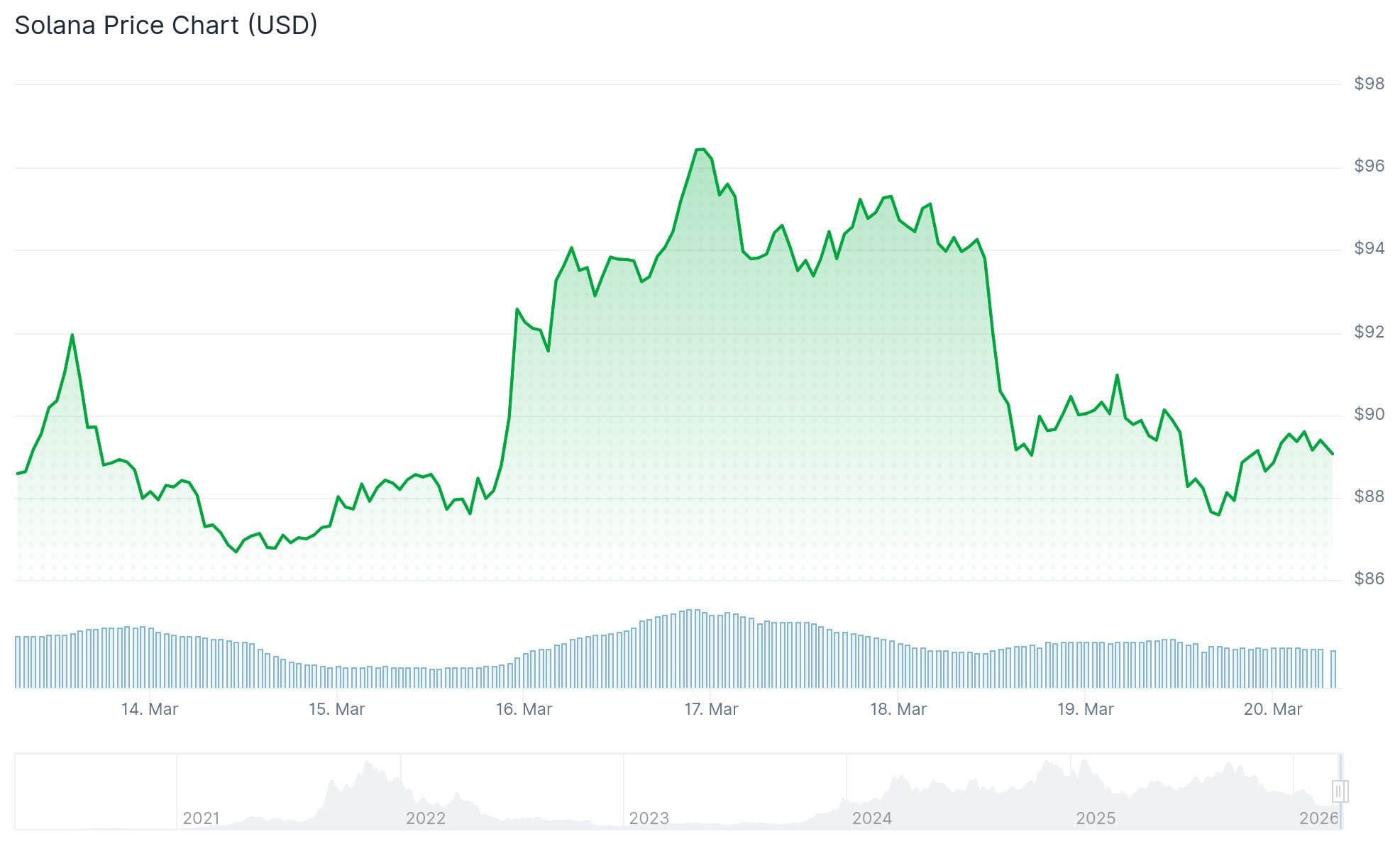
Solana (SOL) 价格下跌11%,DApps收入跌至18个月低点
TLDR SOL 在三天内下跌11%,在周一触及97.70美元高点后跌至87美元,导致2500万美元的多头仓位被清算。SOL永续合约资金费率
相关文章
如何在MEXC盘前永续合约交易EDGE代币:全面指南助您把握DeFi新星交易机遇
核心要点 EDGE代币概览:EDGE是EdgeX去中心化衍生品交易所的原生代币,在平台治理、手续费折扣和质押收益中发挥核心作用盘前交易优势:MEXC盘前永续合约允许投资者在EDGE正式上市前提前布局,把握价格发现阶段的交易机会交易便利性:MEXC交易所已上线EDGEUSDT盘前永续合约,支持最高50倍杠杆交易生态价值:EdgeX作为Base链上的创新DeFi衍生品交易平台,EDGE代币具有多重实用
如何领取EDGE代币空投:EdgeX去中心化交易所平台代币空投完整指南
关键要点 EDGE空投资格:EdgeX通过多轮活动奖励早期支持者和活跃用户,包括创世分配、TGE前赛季和社区贡献者领取时间:EDGE代币生成事件(TGE)已于2026年3月启动,符合条件的用户可以立即查看资格并领取代币领取方式:用户需要连接Base网络兼容钱包到EdgeX官方平台,验证资格后即可领取代币代币用途:EDGE是EdgeX去中心化交易所的原生代币,可用于交易手续费折扣、质押收益和治理投票
EDGE代币是什么?EdgeX交易所原生代币的全面指南
关键要点 EDGE是EdgeX的原生实用代币,这是一个建立在Base区块链上的去中心化衍生品交易所(DEX)EdgeX结合了去中心化金融的透明度和安全性,以及通常在中心化交易所才有的高级交易功能EDGE代币总供应量固定为10亿枚,采用以社区为中心的分配模式该平台提供多个加密货币交易对的永续合约交易,杠杆最高可达50倍EDGE持有者可以参与治理、享受交易手续费折扣并获得质押奖励EdgeX旨在解决传统
黄金为什么下跌,2026年3月宏观抛售背后的核心驱动力与交易策略
近期整个贵金属市场都在问同一个问题:为什么黄金在下跌?随着价格在关键支撑位 4850 美元附近苦苦挣扎,许多习惯了黄金永远上涨叙事的交易者感到措手不及。直接的导火索显然是刚刚结束的重磅宏观事件,但要真正理解这一轮抛售的底层逻辑,我们必须跳出单一的新闻头条,深入剖析目前主导全球资本流动的宏观基本面。3月美联储决议:压垮金价的鹰派重击在刚刚结束的 3 月 18 日至 19 日会议上,美联储如期按兵不动